接下来我们系统的分析各种布局方式。一、absolute
这种方式的布局可以对子元素相对于父级容器控件进行绝对定位,它包含了x、y两个配置项用于定位。
效果如下:
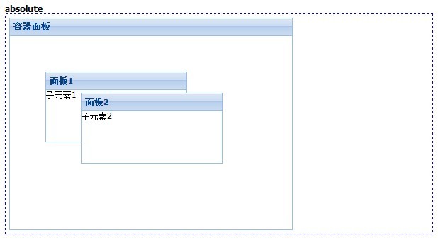
/absolute
Ext.create('Ext.Panel', {
title: '容器面板',
renderTo: 'div1',
width: 400,
height: 300,
layout: 'absolute',
items: [{
title: '面板1',
xtype: "panel",
html: "子元素1",
width: 200,
height: 100,
x: 50,
y: 50
}, {
title: '面板2',
xtype: "panel",
html: "子元素2",
width: 200,
height: 100,
x: 100,
y: 80
}]
});
二、accordion
有的js插件里面accordion都是一个ui控件,但是Ext是通过布局的方式实现的,我们可以用面板控件作为它的折叠项,并且还可以用js来翻动活动项。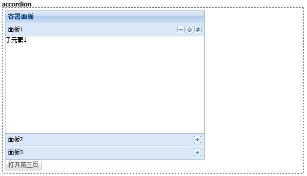
//accordion
Ext.create('Ext.Panel', {
title: '容器面板',
renderTo: 'div2',
width: 400,
height: 300,
layout: 'accordion',
items: [{
tools: [{ type: 'gear', handler: function () {
Ext.Msg.alert('提示', '配置按钮被点击。');
}
}, { type: 'refresh'}],
title: '面板1',
xtype: "panel",
html: "子元素1"
}, {
title: '面板2',
xtype: "panel",
html: "子元素2"
}, {
id: 'panel3',
title: '面板3',
xtype: "panel",
html: "子元素3"
}]
});
Ext.create("Ext.Button", {
renderTo: 'div2',
text: "打开第三页",
handler: function () {
Ext.getCmp('panel3').expand(true);
}
});
三、anchor
这个布局就是表单面板默认支持的,每一项占据一行,支持用anchor配置项分配各个子项的高度和宽度。为百分比时表示当前大小占父容器的百分比,为数字的时一般为负数,表示父容器的值减去差值,剩下的为子项的大小。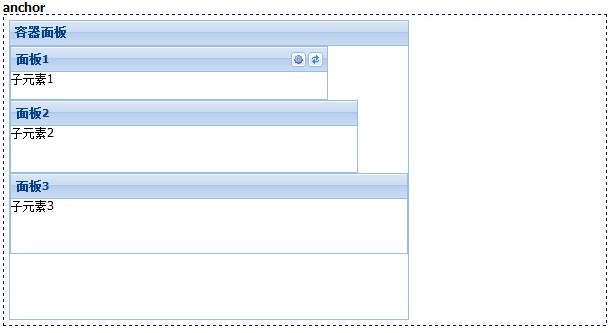
//anchor
Ext.create('Ext.Panel', {
title: '容器面板',
renderTo: 'div3',
width: 400,
height: 300,
layout: 'anchor',
items: [{
tools: [{ type: 'gear', handler: function () {
Ext.Msg.alert('提示', '配置按钮被点击。');
}
}, { type: 'refresh'}],
title: '面板1',
xtype: "panel",
html: "子元素1",
anchor: '80% 20%'
}, {
title: '面板2',
xtype: "panel",
html: "子元素2",
anchor: '-50 -200'
}, {
title: '面板3',
xtype: "panel",
html: "子元素3",
anchor: '100% 30%'
}]
});
四、border
这个布局可以定义东南西北四个方向的子元素,还有一个居中的子元素,一般用它来做页面整页布局,所以Ext.container.Viewport默认就支持了这个布局方式。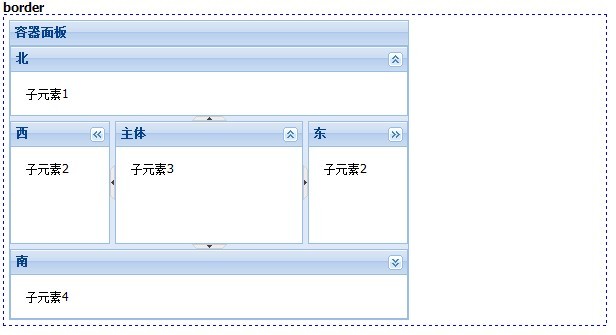
width: 400,
height: 300,
layout: 'border',
defaults: {
split: true, //是否有分割线
collapsible: true, //是否可以折叠
bodyStyle: 'padding:15px'
},
items: [{
region: 'north', //子元素的方位:north、west、east、center、south
title: '北',
xtype: "panel",
html: "子元素1",
height: 70
}, {
region: 'west',
title: '西',
xtype: "panel",
html: "子元素2",
width: 100
}, {
region: 'east',
title: '东',
xtype: "panel",
html: "子元素2",
width: 100
}, {
region: 'center',
title: '主体',
xtype: "panel",
html: "子元素3"
}, {
region: 'south',
title: '南',
xtype: "panel",
html: "子元素4",
height: 70
}]
});
五、card
这个布局可以像卡片一样的切换每个子元素,各个子元素都会独占父元素的容器空间。我们可以定义翻页按钮来控制当前处于活动状态的子元素。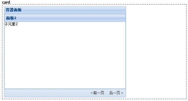
六、column
这个布局把子元素按照列进行划分。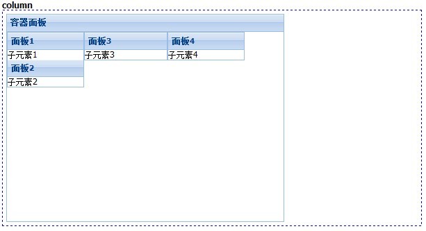
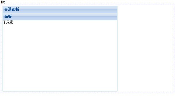
七、fit
这个布局下子元素会独占全部的容器空间,一般用于只有一个子项的情况。
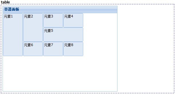
八、table
这个布局用表格定位的方式去组织子元素,我们可以像表格一样设置rowspan和colspan。
更详细资料参考:http://www.iteye.com/topic/1135799
该贴由hui.chen转至本版2015-7-6 12:04:45
 当前位置:
论坛首页 »
自由讨论区 »
Android, Python及开发编程讨论区
»
当前位置:
论坛首页 »
自由讨论区 »
Android, Python及开发编程讨论区
»
 发起投票
发起投票

 技术讨论
技术讨论


 加好友
加好友 发消息
发消息 2015-7-3 22:02:47 |
 赞(
赞( 操作
操作